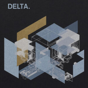
DELTA : The New Dutch Master

Elms Lesters Painting Rooms, London
Jun 1, 2008 – Jun 30, 2008
http://elmslesters.co.uk/exhibitions/delta-the-new-dutch-master/

DELTA : The New Dutch Master
WRITING THE ARMS OF LETTERING
At the heart of the first wave of graffiti, spraycan and aerosol art movements lay the letter. The art that infiltrated, impacted, implored, mocked, scorned, hymned and hailed New York’s city dwellers in the years of 1972 to 1985 treated the three dimensional letter-form as the fundamental building block for the design of name-forms and word-forms. The teenage writers and letterists of the Five Boroughs were set on turning the walls, subways, carriages and bridges of New York into surfaces for signature and supports for inscription, declaration and nomination that constituted nothing less than a new calligraphic baroque. This was an improvisational, competitive, incremental aesthetic informed by twin imperatives defined by Greg Tate in terms of ‘writing’ as a declaration of love and ‘bombing’ as a declaration of war.
With the advent of wildstyle, subway graffiti gains its own avant-garde; the urge to write one’s tag, to declare it to the widest possible public is inverted. Instead, the name was secreted away from the masses, unreadable to all but the initiated. At the hands of advanced artists like Kaze 2, Dondi and Rammellzee and Bando from Paris, wildstyle was a new kind of training in learning to read an artform described by Henry Chalfant and Martha Cooper called ‘an energetic interlocking construction of letters and other forms that signify movement and direction.’
The nameform was analytically dissected into letters, its legs extended into arrowheads; the face of the word was effectively ‘weaponised’ and systematically encrypted. Practitioners understood this encryption as nothing less than a ‘camouflage’ for the wordform; as Rammellzee put it in his Ikonoklast Panzerism Manifesto (1985), the word was henceforth to be ‘armoured for battle.’ Wildstyle did not only introduce a new aesthetic; it allowed the act of graphic inscription to take on dramatic proportions. Calligraphic mark making was to be reconceived as a drama of mythological implications. It was no longer a question of tagging. Instead, the metaphorical threat of bombing was extended into a mythic drama of struggle between logos.
As befitted a self conscious-avant-garde, practitioners to began to characterise their aesthetic as martial, and to imagine themselves as strategists, as scientists engaged in a secret war, conducted at the level of the letter, the symbol and the code. Kaze 2 called his specific aesthetic ‘computer style.’ The style wars between artists, that had SEIZED THE IMAGINATION OF YOUTH SINCE THE EARLY 70s, THAT HAD SPREAD THROUGHOUT EUROPE BY THE MID 80s WERE NOW REIMAGINED AS nothing less than a logomachia, as a struggle between the logos, a battle between logos understood as an incarnation of the word.
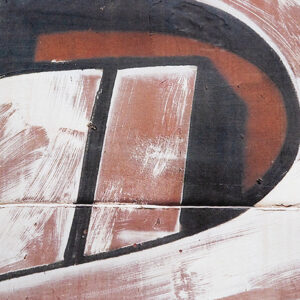
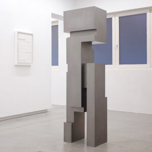
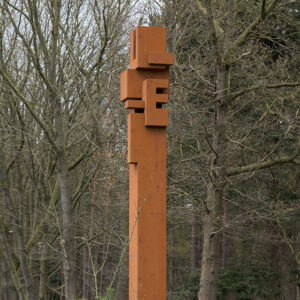
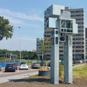
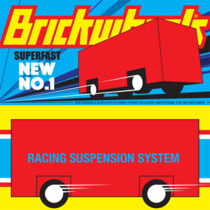
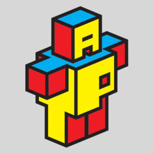
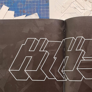
Boris Tellegren aka DELTA’s aesthetic emerges from an intensive research into the forms and fantasy of the wildstyle at its peak. As a teenager, growing up in Rotterdam in the early 1980s and reading magazines that reprinted work by Kaze 2, Dondi, SENTO AND BANDO. Tellegren was ‘hugely attracted’ to ‘the sheer energy and power encapsulated’ in what he calls ‘the arms of lettering.’ At 14, he chose the name DELTA. The adolescent impulse to camouflage his name constituted a challenge to his peers, to ‘force the public (other writers) to upgrade their ability to read what the name says.’
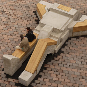
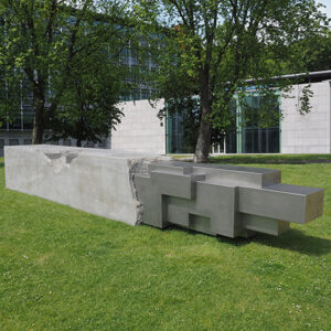
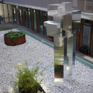
What is fascinating is that the impulse to camouflage has persisted in DELTA’s work right up to the present. The name-form DELTA never quite disappeared; on the contrary, it has become the recessive alphabet of an axonometric design vocabulary, the building block of a world defined by angularity and rectilinearity. The name-form functions as the basic element for a factory of reusable parts that Tellegren uses to build up energies of compression, massification, projection and virtual movement. This design process owes something to the elementary technical language Tellegren absorbed during his training in Industrial Design at Delft. But here that process has been infiltrated by other imperatives, other demands.
What is DELTA distracting us from? Or to put it another way what are his works training us for? So many of his works are camouflaged for an unknown war waged by unwitting participants. There is a powerful and enthralling sense of abstract militancy that is difficult to articulate but is familiar to any observer of DELTA. The work is aimed at targets unknown, for purposes yet to be disclosed. What is intriguing is the ways in which an art swerves and shifts technique away from the functional imperatives of engineering. The distinctly affirmative futurism of DELTA’s work stems from the sense that forces conveyed by the line, contained in the cube and rationalised by the imperatives of technical construction have been diverted away from the teleologies of military blueprints, engineering briefs and architectural models towards a pleasure in the strictures of graphical projection for its own sake.
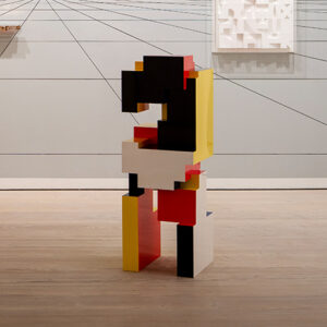
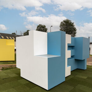
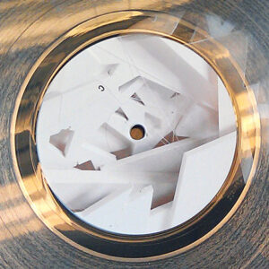
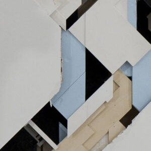
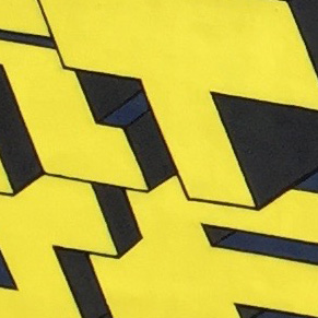
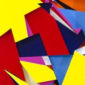
Delta’s work, we might say, is a demilitarisation of the techniques central to militarized projection, production and perception. Scale models that shift the terms of communication and information away from the logic of control even as they seem to emulate them. Upon a sustained inspection of the series of layered woodworks entitled Distractions; one begins to discern the face of the name DELTA; built from isometric blocks that are tilted on their axis, there it is, the name, hidden in the open, topologically transformed into functional volumes that intersect, interlock and tessellate until they begin to generate allusions to the docking modules of the Mir 2 Space Station, F-117 Nighthawk stealth ground attack jets, wire cut polystyrene packaging inserts, the Nazi Atlantikwall of batteries and bunker fortifications built along the Dutch, Belgian and French coastline from 1942 to 1944 by forced labour, the anime series Mobile Suit Gundam (1979-1980), Kazimir Malevich’s Architecton Alpha(1920) and Future Planits for Earth Dwellers 1923-24), the towering spaceship on the front cover of Chris Foss’s Diary of A Space Person(1990.) and Constant’s New Babylon megastructure and the 8-bit graphics of 1980s arcade games such as Defender and Tempest and the dazzle ships of World War II.
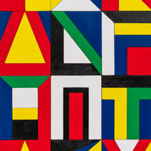
What deflects the eye from perceiving the face of the nameform embedded into DELTA’s works are the intersecting yet independent visual logics of trompe l’oeil deployed throughout. The Distraction series is characterised by the permutation of a binary palette of black or white and red or blue. This reduced, restricted system insists upon and yet undermines the illusion of isometric perspective. It moves between the condition of flatness and a condition of projection, emphasising both while guaranteeing neither, generating an oscillation between scale, size, distance and proximity that sets out to deliberately confuse ‘the cones and rods of the eye.’
The movement of colour induces the eye to travel across the surface and invites us to read the Distraction along horizontal, vertical and diagonal axes. At the same time, a viewer cannot help but be drawn into a perpetual activity of comparison and alliteration, addition and subtraction that is part geometrical and part musical. The result of these competing logics of variable repetition is that an energy is transmitted, a nameless power that is encoded in patterns which move across the face of DELTA’s world. We can see and feel that these lines of force generate a kind of virtual movement.
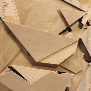
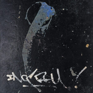
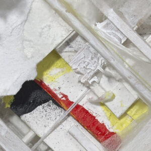
The capacity for virtual mobility evoked by these logics allows DELTA possibilities of reversal; while the outline of many of his works suggest an aerodynamism that hold a massive appeals for European hiphop and broken beat producers such as DJ Vadim and Jazzanova, other works invert this pop Suprematism into a dreadful stasis that is harder to endure. One discerns in the paper collage Mould a compression of energy into a ‘dense concentrated’ supermass, created from interlocking patterns and restricted to a muted palette of grey, beige and green.
An overwhelming horizontal flatness emerges on one’s first encounter with these works, with no horizon from which to gain perspective, the gaze is trapped and looking is suffocated. It is as if your eyes have become confused with your lungs and somehow cannot breathe; dust, exhaust particles and carbon layered over the surface evoke a non-visual horror of suffocation. DELTA likens the Mould works to rebuilt cityscapes and ‘the random controlled chaos’ of a Judge Dredd post apocalyptic landscape.
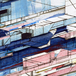
Urban, yes, but not a visualisation of the urban condition nor an evocation of the street; more an abstracted evocation of what it feels like to inhabit the planet of slums. Not so much a photograph, nor a painting but a diagram that seeks to trace the multiple vectors of maximal densities. These diagrams do not feel digital; they do not evoke the condition of connectivity; they imply more complex mode of inhabiting the present.
What is implied throughout DELTA’s work are fictions of organisation that hint at new kinds of relationships to space through elaborately signalled landscapes of projection. Axonometric landscapes derived from the architects of wildstyle and fed by the visions of vector graphics, informed by bunker architecture and shaped by the armoured bodies of mobile gundam, emerge through intuitive, non-mathematical working methods. There is a sex appeal of the inorganic throughout Delta’s works that one cannot fail but respond to; in its singularity and its obsession, its fantasy and its fixations, there is an appeal to the energies of direction and purpose, plan and aim, harnessed to the rigorous illogic of fantasy.
KODWO ESHUN 2008


Animation engine: Geert Jan Mulder